|
wash/flat wash – A thin liquid application of paint. A graded wash varies in color from light to dark. A wash over a dry under painting is sometimes called a glaze.
drybrush– A watercolor painting technique where little paint or water is applied to the brush creating a skipped, grainy look. intensity-the brightness or dullness of a hue. lifting paint-remove or erase watercolor from the surface of a painting masking fluid- a liquid used to block out areas of a watercolor while you paint color temperature Wet-on-dry – Using wet paint on a dry surface. Wet-on-wet – Painting additional color into a wet area, creating bleeding colors and a soft effect. blotting-using an absorbent material such as tissues or paper towels, or a squeezed out brush, to pick up and lighten a wet or damp wash
0 Comments
 what do I plan on doing to finish my piece?
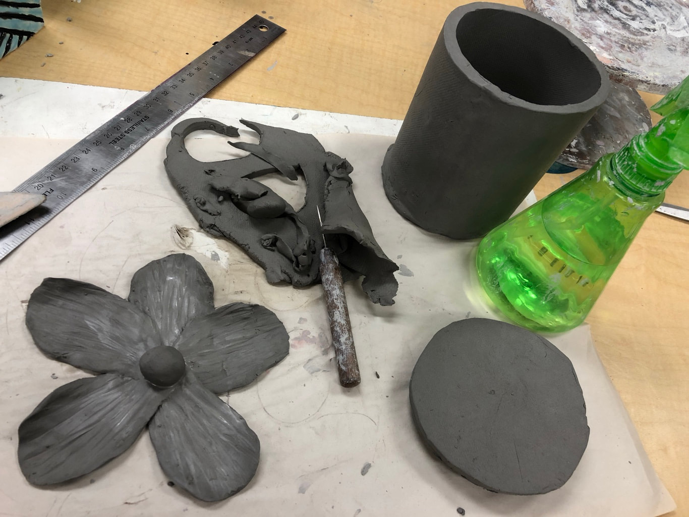
I plan on first adding texture to the knob/the middle of the flower. Then I'll score and slip to attach the flower to the lid. Then I plan on adding some texture and a pattern to the vessel but I'm not sure what yet. what things have been difficult? why? The 2 most difficult things so far have been making the flower and getting the salad size correct. I had to make the flower twice before I got it how I wanted it, and then the third time it broke! And I had to roll my slab out 5 or 6 times before I got it the size I wanted it. what has been successful so far? cutting the lid/ bottom out were a lot easier than I expected so that was successful. the process: first I sketched out my idea, then I rolled out a slab of clay until I got my desired size. Then I rolled it around a pvc pipe that I had wrapped in paper. Then I made another slab and traced and cut out the top and bottom to create the lid and bottom of the vessel. Then I made my flowe by pinching off balls of clay and flatting them. Then I made 3 balls of clay and attached them to the bottom of my lid using the scratch and slip method. That is all I've done so far. 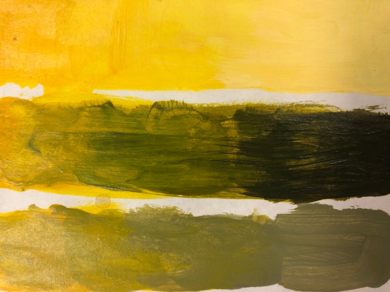 hue value scale  most helpful warmup 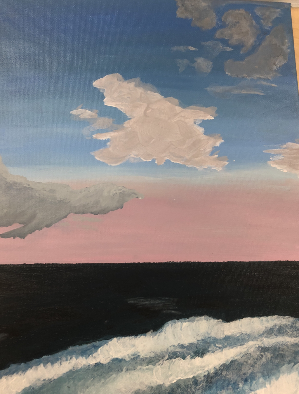 finished piece What place is represented in your art? Why is it important?
The place represented in this painting is Surf City, North Carolina. The picture was taken from the porch of my beach house at my favorite time of day at the beach, sunset. This place is very important to me because it is where I am happiest. As we started this project, hurricane Florence hit the small beach town and it was hit very hard. What did you find most challenging about the picture you picked? The most difficult part of this painting was getting the detail in the waves. Getting the clouds to look as realistic as possible was very hard as well. What is the most successful part of the piece? I think the most successful part of my painting is getting the texture in the waves The Process First I started with a base of light purple. Then I started on the gradient of blue to pink, once I was happy with that I painted the smooth, dark part of the ocean. Once I was done with the "easier" parts i moved on to the crashing waves. Then I painted the clouds last. 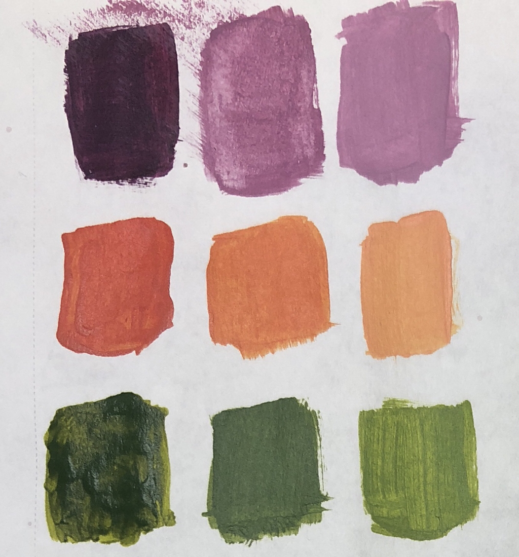 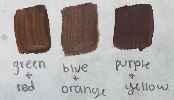  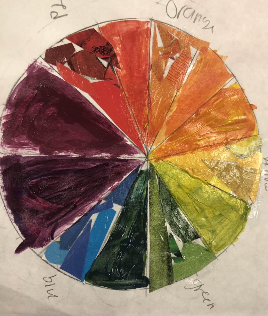 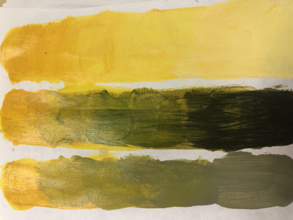 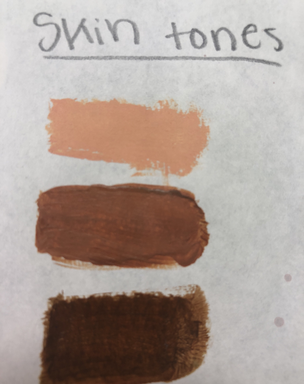 what did I learn?
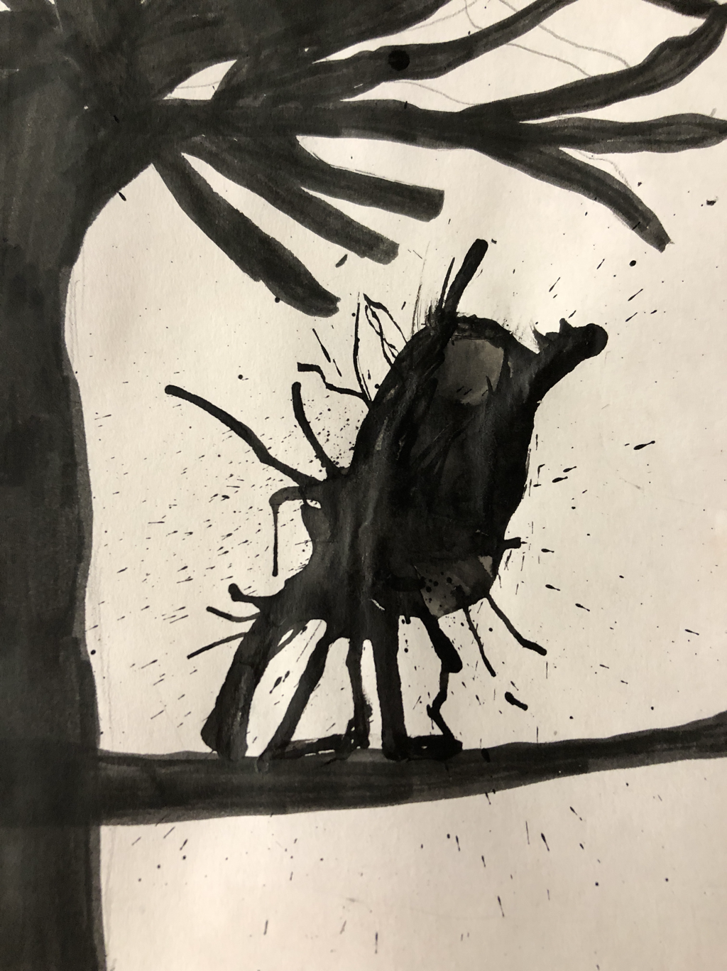
in these warm ups I learned a lot of new techniques to create new textures and different styles of paintings. which warm up will help me the most in my project? I believe that the tones, shades, and tints warm up will help me the most because my painting has a mixture of blues. what warm up did I learn the most from? the warm up I learned the most from is the skin tones one because before that I did not know that skin had different undertones such as pink or blue. what are some ways to make brown? 3 ways to make brown are red & green, blue & orange, and yellow & purple. To make brown you combine 2 complementary colors how do you tone down a color? To tone down a color you can either add gray or add a tiny bit of the complementary color. 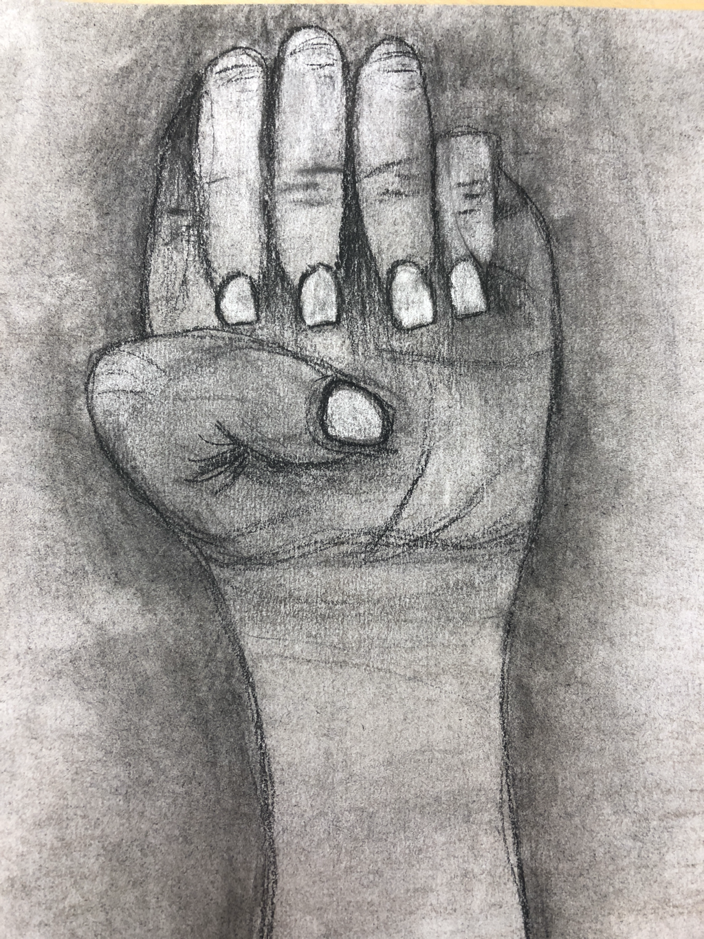 charcoal drawing 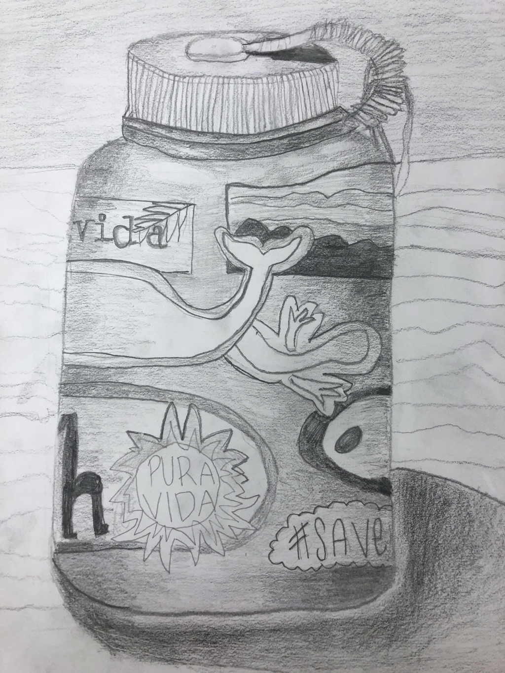 pencil drawing  pen drawing  most helpful warmup (sign language a) I think the sign language a was the most helpful warm up for me because it helped me realize how to draw value realistically. This warm up was the first time that I had ever drawn by outlining the shapes first then adding detail and that helped me a lot, especially in my pen and charcoal drawing. Definitions: value- element of design that defines the lights and darks in artwork pros of pen-
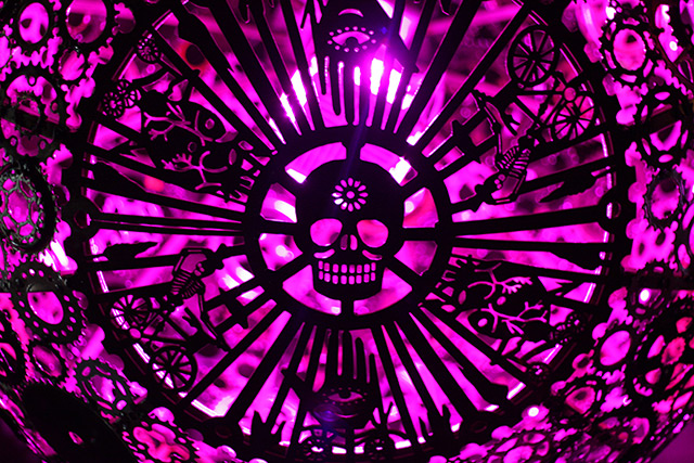
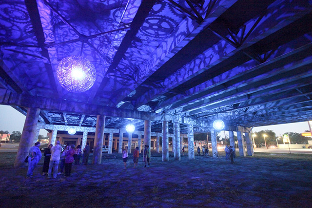
different techniques give different effects on the drawing cons of pen- cannot erase pros of pencil- easy to create value easy to erase cons of pencil- only one way to draw value pros of charcoal- easily creates value easy to erase cons of charcoal- very messy better to work with on large paper This piece is an art installation consisting of 6 chandeliers. The sculptures are chandeliers made out of steel, LED lights, and recycled bike parts. The chandeliers are made by Joe O'Connell and Blessing Hancock. The art initially drew me in because of the colorful silhouettes and intricate medallions. I also thought it was very interesting that 2 people created these pieces. The most interesting part to these artworks is the fact that they are located under a cement underpass in San Antonio, Texas. So obviously it is the bright purples and blues that first catch your eye when you look at these artworks, but what is it that gets you to read about them. For me it was 2 things. The first being that chandeliers could be made out of bike parts, because I don't know about you but when I think of bikes I think of kind of bulky, metal things used for transportation. In this artwork bikes are used in a way I've never thought of using them before and I know that that will inspire me to use unexpected materials in upcoming projects. The second thing is that these are located under a cement underpass. That surprises me so much, but also inspires me to think about new and un-thought of locations to put art. I think the thought of putting such interesting art in such a boring place is brilliant.
|

|